Skip to content
Home » ANALYTICS DATA & GROWTH
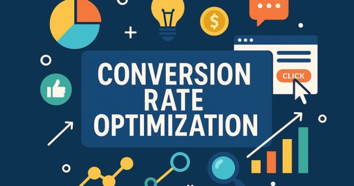
What Is Conversion Rate Optimization (CRO)?
A skincare website once doubled its advertising budget, expecting sales to rise proportionally. Traffic did increase significantly, but sales barely moved. The real issue wasn’t visibility at all — it was that only a tiny fraction of visitors who arrived ever actually completed a purchase. More traffic poured into a leaky bucket rarely fixes the leak itself. That’s exactly the problem conversion rate optimization is designed to solve.
We’ve now explored analytics, KPIs, A/B testing, and customer journey mapping. This final post in the Analytics, Data & Growth section brings these ideas together under one practical, results-focused discipline.
What CRO Actually Means
Conversion rate optimization is the ongoing practice of improving the percentage of website visitors who take a desired action — making a purchase, signing up, filling out a form — without necessarily needing to increase overall traffic at all.
Instead of asking “how do we get more visitors,” CRO asks a different, often more cost-effective question: “how do we get more value out of the visitors we already have?”
Why This Approach Often Delivers Better Results Than Chasing More Traffic
Bringing in additional visitors through advertising or content typically costs time, money, or both. Improving your conversion rate, on the other hand, means extracting more value from an audience you’ve already earned — often at a fraction of the cost of acquiring entirely new visitors.
Consider a simple comparison: doubling your traffic while keeping the same low conversion rate roughly doubles your results. But doubling your conversion rate while keeping the same traffic level produces the exact same outcome, often without spending anything extra on advertising at all.

The Core Elements CRO Typically Focuses On
Clarity of messaging — Does the page immediately and clearly communicate what you’re offering and why it matters, or does it require visitors to work hard just to understand the basics?
Trust signals — Reviews, testimonials, security badges, and clear policies that reduce hesitation and doubt before a purchase decision.
Friction in the process — Unnecessary steps, confusing forms, or slow loading times that quietly discourage visitors from completing an action.
Call-to-action visibility and clarity — Whether the next step you want a visitor to take is obvious, compelling, and easy to find.
Mobile experience — Since a significant portion of traffic often arrives through phones, a clunky mobile experience can silently kill conversions that would otherwise happen smoothly on desktop.
How CRO Connects to Everything We’ve Covered So Far
CRO isn’t a standalone tactic — it draws directly from the tools covered throughout this section. Analytics reveals where visitors are dropping off. KPIs clarify which specific numbers actually reflect meaningful progress. A/B testing provides the method for testing potential improvements. Customer journey mapping reveals the broader context behind where and why friction exists.
CRO is essentially where all of these pieces come together into deliberate, ongoing action.
A Simple Example
Imagine an online store selling handmade leather wallets. Analytics reveals a large number of visitors reach the checkout page but abandon it before completing payment.
Digging deeper through journey mapping, the team notices the checkout process requires creating a full account before purchasing, an unexpected extra step that seems to be causing hesitation. Using A/B testing, they introduce a guest checkout option alongside the existing account requirement, then compare completion rates between the two options.
The guest checkout version significantly reduces abandonment, and the business implements it permanently. No additional advertising spend was involved — the exact same traffic simply converted more effectively once a specific point of friction was identified and removed.

Common Areas Worth Reviewing First
Your highest-traffic pages. Improvements here tend to have the largest overall impact, simply because more people are seeing them.
Your checkout or sign-up process. Even small friction points at this critical final stage can quietly cost significant conversions.
Pages with unusually high drop-off rates. As covered in our post on Analytics, identifying exactly where visitors leave often reveals the clearest opportunities for improvement.
Your most important call-to-action buttons. Ensuring these are clear, visible, and compelling across your key pages often produces outsized results relative to the effort involved.
How to Start Improving Your Own Conversion Rate
Step 1: Identify your current conversion rate for a specific, important action, so you have a clear baseline to improve from.
Step 2: Use analytics and journey mapping to identify where visitors are most likely dropping off before completing that action.
Step 3: Form a specific hypothesis about why that drop-off might be happening — confusing wording, lack of trust, too many steps.
Step 4: Test a targeted change addressing that specific hypothesis, rather than making broad, unfocused adjustments.
Step 5: Measure results honestly, implement genuine improvements, and continue the cycle regularly rather than treating it as a one-time fix.

Common Myths Worth Clearing Up
“CRO means constantly redesigning your entire website.”
Effective CRO usually involves small, targeted, evidence-based changes rather than large, sweeping redesigns based on assumption.
“More traffic is always the better investment.”
Traffic without strong conversion often wastes potential value already sitting within your existing audience.
“CRO is a one-time project you eventually finish.” Over time, consumer expectations, purchasing patterns, and preferences shift. In five years, a website designed for today’s users could not be appealing to them. Rivals constantly update their own websites, products, and messaging. You can avoid losing market share to more pertinent or seamless alternatives by continuously optimising your business. Operating systems, browsers, and gadgets are constantly being released. For websites to function perfectly on all new platforms, they must be continuously optimised.
Visitor behavior, expectations, and competition constantly shift, meaning genuine CRO is an ongoing, continuous habit rather than a single completed task.
Wrapping Up This Section
Across this stretch of posts, we’ve moved from understanding raw visitor data, to identifying which specific metrics genuinely matter, to testing changes scientifically, to mapping the full customer experience, and finally, to actively optimizing that experience for stronger results.
Together, these tools form the backbone of genuinely data-driven marketing — replacing assumption and guesswork with real evidence, and turning existing traffic and effort into meaningfully better outcomes over time.
Understanding Customer Journey Mapping
A software company once spent months improving their landing page, convinced that was where they were losing customers. After finally mapping the entire customer experience from start to finish, they discovered the real problem was buried three steps later, in a confusing account setup process nobody on the marketing team had ever actually walked through themselves. Fixing the landing page would have changed nothing. Seeing the full journey changed everything.
We just explored how A/B testing helps improve individual elements. Now let’s zoom out and look at the bigger picture those individual tests often live inside — the complete path a customer travels from first contact to loyal, repeat buyer.
What Customer Journey Mapping Actually Is
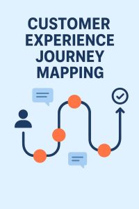
Customer journey mapping is the process of visually laying out every stage a customer goes through when interacting with your brand — from the very first moment they become aware you exist, through consideration, purchase, and beyond.
Rather than focusing on a single touchpoint like a webpage or an ad, journey mapping captures the entire experience as one connected story, revealing exactly where things flow smoothly and where friction quietly builds up.
Why This Exercise Matters So Much
Teams often become deeply familiar with their own specific piece of the puzzle — a marketer knows the ad campaign inside out, a designer knows the website deeply, a support team knows common customer complaints. But rarely does anyone step back and experience the entire journey exactly as a real customer would, start to finish.
This narrow view creates blind spots. A beautifully designed ad might drive genuine interest, only for that momentum to die at a confusing sign-up form nobody on the ad team ever noticed existed.
The Typical Stages Covered in a Journey Map

Awareness — How does someone first discover your brand? A social media post, a friend’s recommendation, a search result?
Consideration — What do they explore next? Your website, reviews, comparisons with competitors?
Decision — What finally convinces them to commit — pricing clarity, trust signals, a specific persuasive detail?
Onboarding or first use — What happens immediately after purchase? Is the experience smooth, confusing, delightful, frustrating?
Ongoing use or loyalty — Do they return, recommend you to others, or quietly drift away after the initial purchase?
Mapping each of these stages honestly, from the customer’s actual perspective rather than an internal assumption, often reveals surprising gaps.
How to Actually Build a Journey Map
Step 1: Define a specific customer type. Rather than mapping a vague, generic “everyone,” focus on one realistic type of customer with a clear starting point and goal.
Step 2: List every touchpoint they encounter. Every ad, webpage, email, support interaction, or product experience that customer might pass through, in order.
Step 3: Identify their goal and mindset at each stage. What are they trying to accomplish, and what questions or doubts might be running through their mind at that specific point?
Step 4: Spot friction points honestly. Where might confusion, frustration, or unnecessary delay realistically occur? This step often requires genuinely experiencing your own process as a customer would, rather than relying on assumption.
Step 5: Identify improvement opportunities. Once friction points are visible, prioritize fixing the ones causing the most significant drop-off first.
A Simple Example

Imagine an online course platform mapping the journey of someone interested in learning graphic design.
Awareness: They discover the platform through a YouTube ad showcasing student projects.
Consideration: They browse the course page, read a few reviews, and check the syllabus.
Decision: Seeing a clear beginner-friendly promise and a reasonable price convinces them to enroll.
Onboarding: After purchasing, they’re dropped straight into Lesson One, with no clear welcome message or guidance on where to start, leaving them slightly confused about pacing and expectations.
Ongoing use: Because that confusing start left a slightly negative impression, they complete the course but never explore other offerings from the same platform.
By mapping this out, the company realizes their marketing and sales process works beautifully — awareness, consideration, and decision are all strong. The real weakness lives in onboarding, an area the marketing team had never closely examined, since it technically falls outside typical “marketing” responsibilities.

Common Mistakes When Mapping a Customer Journey
Mapping from an internal, company-centered view rather than the customer’s actual experience. It’s easy to describe what your team intends to happen at each stage, rather than what genuinely happens from the customer’s perspective.
Focusing only on the path toward purchase, ignoring what happens afterward. Onboarding, ongoing use, and loyalty stages are just as important as the initial sale, especially for subscription or repeat-purchase businesses.
Assuming one journey fits every customer type. Different customer segments often take meaningfully different paths, with different concerns and touchpoints along the way.
Creating the map once and never revisiting it. Customer behavior and expectations shift over time, meaning journey maps benefit from periodic review and updates.
Why This Exercise Pays Off Long-Term
Customer journey mapping forces a shift in perspective — Teams in charge of marketing, sales, products, and support usually only see the client through their particular touchpoint. By bringing different departments together under a common visual reference point, journey mapping increases the visibility of handoffs, dependencies, and communication gaps. Internal teams frequently believe that the consumer will receive the same experience that they provide. By displaying the precise times a user struggles—moments that are often missed by conventional metric tracking—a map bridges this gap. This mapping compels teams to give priority to high-emotion and high-effort touchpoints rather than treating every connection equally. It demonstrates how a small fix may turn annoyance into brand loyalty. from viewing your business through your own internal departments, to viewing it as one continuous, connected experience through the customer’s eyes. That shift alone often reveals opportunities that isolated fixes, like a single A/B test or an isolated marketing campaign, would never surface on their own.
What’s Next?
Understanding the full journey reveals where friction exists. The next logical step is actively working to reduce that friction wherever it appears, turning more visitors into paying customers. In our next post, we’ll explore conversion rate optimization, and how small, deliberate changes across a website can meaningfully improve results.
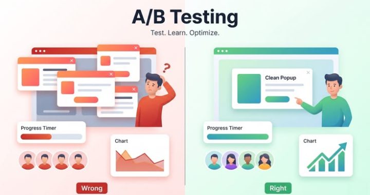
What Is A/B Testing, and How to Run Your First Test

all at once, and one version performs better, you won’t actually know which specific change caused the improvement.
Testing one variable at a time is slower, but it also produces genuinely reliable, actionable insight — rather than a confusing mix of untraceable changes.
What You Can Actually Test
Headlines and titles — Different phrasing, tone, or angles for the same core message.
Call-to-action buttons — Wording, color, size, or placement on a page.
Images and visuals — Different photos, illustrations, or video thumbnails representing the same content.
Email subject lines — Testing which phrasing earns higher open rates before even considering the email’s actual content.
Page layout and structure — Where key information or buttons are positioned on the page.
How to Actually Run Your First Test
Step 1: Pick one clear goal. Decide exactly what you’re measuring — clicks, sign-ups, purchases — before starting, so you know precisely what “better” actually means.
Step 2: Select just one variable to examine.. Resist the temptation to change multiple elements simultaneously, even if it feels efficient.
Step 3: Split your audience fairly. Ideally, visitors should be randomly assigned to either version, ensuring neither group is biased toward a particular outcome from the start.
Step 4: Let it run long enough for meaningful data. Ending a test too early, based on a small sample, often produces misleading results that don’t hold up over time.
Step 5: Analyze the results honestly. If the difference between versions is small or unclear, it may not represent a genuinely meaningful improvement worth implementing.
Step 6: Implement the winner, then test again. A/B testing isn’t a one-time event — it’s an ongoing habit of continuous, incremental improvement.
A Simple Example :
Imagine an online plant shop testing two versions of their homepage banner. Version A reads “Bring Nature Into Your Home.” Version B reads “Plants That Actually Survive Beginners.”
After running the test for two weeks with a reasonably sized audience, Version B produces noticeably more clicks toward the shop page. The specific, slightly humorous promise of surviving as a beginner apparently resonated more directly with visitor concerns than the more generic, poetic phrasing in Version A.
Without testing, the shop might have simply kept the original banner indefinitely, assuming it was “good enough,” never realizing a small wording change could meaningfully shift visitor behavior.
Common Mistakes Beginners Make
Testing too many variables simultaneously. This makes it impossible to identify exactly what caused any change in results.
Ending tests too early. A slight early lead for one version can easily reverse once more data comes in, especially with smaller audiences.
Testing something that doesn’t actually matter much. Spending weeks testing a minor color shade, while ignoring a confusing checkout process, misplaces effort on low-impact changes.
Ignoring statistical significance. A small difference between two versions might simply be random variation, not a genuinely reliable pattern worth acting on.
Why Small Tests Can Lead to Meaningful Growth Over Time
A single A/B test rarely transforms a business overnight. Localised leaks in the funnel can be fixed by modifying current assets, but a fundamentally broken product-market fit or company strategy cannot be fixed A/B testing can optimise (finding a local maximum), but it typically doesn’t help you change course and create a whole new, revolutionary product (finding a global maximum). Since many tests produce neutral or inconclusive results, no adjustment should be made right away. .It takes weeks or even months to achieve statistical significance unless a company has enormous, enterprise-level web traffic. Wide-ranging adjustments to incomplete data frequently result in “false positives,” where early improvements eventually vanish. The real power comes from consistently testing, learning, and refining over months and years — small , evidence-based improvements accumulating into significant overall gains, far more reliably than occasional large, untested changes based on guesswork.
What’s Next?
Testing individual elements like headlines and buttons is powerful, but it only tells part of the story. To truly understand where visitors are dropping off or getting stuck, it helps to zoom out and map their entire experience with your brand. In the next post, we’ll explore customer journey mapping, and how understanding that full path can reveal opportunities testing alone might miss.
What Are KPIs? The Metrics That Actually Matter (and Which Ones Don’t)

A mobile app once celebrated crossing one million downloads with a company-wide announcement, cake included. Six months later, fewer than two percent of those users had opened the app more than once. The download number looked impressive on a slide, but it wasn’t actually measuring anything close to real success. That’s the exact trap KPIs are meant to help you avoid.
In our last post, we explored how to read Google Analytics. Now let’s tackle a closely related question: out of the dozens of numbers available to track, which ones genuinely deserve your attention?
What Is a KPI, in Plain Terms?
KPI stands for Key Performance Indicator — a specific, measurable number tied directly to a goal that actually matters for your business or project.
The keyword here is key. Not every number you can measure deserves to be called a KPI. A true KPI is chosen deliberately because it reflects genuine progress toward something meaningful, not just something easy or satisfying to track.
Why Picking the Right KPI Matters So Much
Tracking the wrong numbers doesn’t just waste time — it can actively mislead decision-making. A business celebrating rising website visitors while sales quietly decline is optimizing for the wrong signal entirely. The visitor count feels good, but it isn’t connected to what actually keeps the business alive.
Effective KPIs serve as a compass, directing focus away from whatever figure is currently increasing and toward what actually propels growth.
Vanity Metrics: The Numbers That Feel Good But Mean Little
Total followers or subscribers — A large following sounds impressive, but if engagement and conversions remain flat, that number alone isn’t driving real results.

If a page receives a lot of traffic but never generates leads or customers, it’s not always a success.
Likes and generic engagement — A post covered in likes doesn’t automatically translate into sales, sign-ups, or loyal customers.
These aren’t useless numbers entirely — they can offer helpful context. The problem arises when they’re treated as the main measure of success, rather than a supporting detail.
KPIs That Genuinely Tend to Matter
Conversion rate — The percentage of visitors who complete a meaningful action, like making a purchase or submitting a form. This connects traffic directly to actual outcomes.
Customer acquisition cost — How much it costs, on average, to gain a single new customer. This aids in determining the true sustainability of your marketing expenditures.
Customer lifetime value — The total revenue a customer is expected to generate over their entire relationship with your business, not just their first purchase.
Retention rate — The proportion of consumers or users who stick around over time as opposed to making one attempt and then leaving.
Return on ad spend — For paid campaigns, this measures how much revenue is generated for every unit of money spent on advertising.
How to Select the Appropriate KPIs for Your Particular Objectives
There’s no single universal list of “correct” KPIs — the right ones depend entirely on what you’re actually trying to achieve.
Start with your actual goal, not available data. Ask what success genuinely looks like for your specific project, then work backward to find the number that best reflects that outcome.
Limit yourself to a small handful. Tracking different metrics frequently increases confusion rather than clarity. A focused set of three to five meaningful KPIs tends to guide decisions far more effectively.
Reassess periodically. As goals shift — from building initial awareness to focusing on retention, for instance — the KPIs worth prioritizing often shift too.
A Simple Example
Imagine a subscription meal-kit company in its early stages, focused purely on growing subscriber numbers. New sign-ups climb steadily, and the team celebrates each milestone.
But a closer look reveals nearly half of new subscribers cancel within the first month. Total subscriber count kept climbing, masking a serious underlying problem: retention. Once the company shifted its primary KPI from raw sign-ups to first-month retention rate, they identified specific onboarding issues causing early cancellations, and fixed them directly — something the sign-up number alone had been quietly hiding.
Common Mistakes When Choosing KPIs
Seeking measures that are simple to monitor but may not be significant. Some numbers are simply more visible or satisfying to watch grow, even if they don’t reflect genuine progress.
Copying KPIs from another business without adapting them. What counts for a small, sustainable local business that prioritises loyalty could be completely different from what matters for a rapidly expanding startup chasing growth.
Ignoring the relationship between metrics. A rising conversion rate paired with a declining customer lifetime value, for instance, might indicate you’re attracting the wrong type of customer, even though one number alone looks positive.
How to Start Applying This
Step 1:Right now, list your top priorities: brand awareness, growth, retention, and profitability.
Step 2: Identify one or two numbers that would genuinely reflect progress toward that specific goal, rather than numbers that are simply available.
Step 3: Set a realistic benchmark or target for that number, based on your current baseline.
Step 4: Review it consistently, adjusting your approach based on real movement, not assumptions.
Why This Mindset Shift Matters Long-Term
Choosing the right KPIs is less about spreadsheets and more about discipline Instead of tracking fifty vanity metrics just because your program can display them, discipline compels you to choose three to five KPIs that actually matter. Discipline is required for weekly report reviews, holding teams responsible for subpar work, and refusing to alter goals every month. — resisting the pull of numbers that simply feel good to watch rise, and staying focused on what genuinely reflects meaningful progress. Marketers and business owners who master this distinction tend to make sharper decisions, faster, because they’re not distracted by noise disguised as success. What’s Next?
Once you know which numbers actually matter, the natural next step is figuring out how to actively improve them. In the next post, we’ll explore A/B testing —a practical, evidence-based method for testing changes and discovering what genuinely moves your key metrics in the right direction.
What Is Google Analytics, and How to Read It Like a Pro

A bakery owner once told a friend her website was “doing great” because people kept telling her they’d visited it. Weeks later, she checked her analytics for the first time and discovered ninety percent of those visitors left within eight seconds, without scrolling past the homepage. Compliments felt good, but the numbers told a very different, far more useful story.
This post opens a new section of our series, moving from creative and strategic topics into the world of data We’ll begin with Google Analytics, the most popular tool for figuring out what’s really going on on a website.
What Google Analytics Actually Is
Google Analytics is a free tool that tracks and reports on how people behave on your website — where they come from, what pages they visit, how long they stay, and what actions they take before leaving.
Instead of guessing whether your website is working, Analytics replaces guesswork with actual evidence. It turns invisible visitor behavior into readable patterns you can act on.
Why This Tool Matters So Much
Without data, decisions about a website often rely on assumptions or gut feeling. Someone might assume their homepage is engaging simply because they personally like the design, while visitors are quietly bouncing off within seconds.
Analytics removes that guesswork by answering questions like:
Where are visitors actually coming from — search engines, social media, direct links?
Which pages keep people engaged, and which ones drive them away quickly?
Are visitors completing the actions you want, like signing up or making a purchase?
The Core Metrics Worth Understanding First
Users and Sessions — Users count unique visitors, while sessions count individual visits, including repeat ones from the same person. A single visitor browsing your site twice in one day counts as one user but two sessions.
Traffic Sources — This shows where visitors originated from: organic search, social media, direct typing of your URL, referral links from other sites, or paid ads.
Bounce Rate — The percentage of visitors who leave after viewing only a single page, without exploring further. A high bounce rate on an important page often signals something isn’t resonating.
Average Engagement Time — The average amount of time visitors spend actively interacting with your website is a powerful indicator of whether or not your material is actually capturing their attention.
Conversion Events — Specific actions you’ve defined as valuable, such as completing a purchase, submitting a form, or clicking a particular button.

How to Actually Read These Numbers Like a Pro
Numbers alone don’t mean much without context. The real skill lies in comparing data over time and asking why patterns exist, rather than just glancing at a single figure.
Compare periods, not just snapshots. A single day’s traffic tells you very little. Comparing this month against last month, or this quarter against the same quarter last year, reveals actual trends.
Look at bounce rate alongside the page’s purpose. A high bounce rate on a blog post that fully answers a reader’s question in one page isn’t necessarily bad — but the same bounce rate on your checkout page is a serious red flag worth investigating.
Follow the visitor’s path, not just entry points. Understanding which page someone visited after landing on your site often reveals more about their real intent than the entry page alone.
Segment your audience. Instead of viewing all visitors as one group, break them down by traffic source, device type, or location. A page performing poorly overall might actually be thriving with one specific segment, hidden inside an average.
A Practical Example
Picture an online store selling handcrafted jewelry. Checking Analytics, the owner notices a specific blog post about “how to layer necklaces” is bringing in significant traffic from search engines, but almost none of those visitors ever reach the product pages.
Rather than assuming the traffic is worthless, she investigates further and realizes the blog post has no visible link guiding readers toward relevant product pages. After adding a clear internal link within the article, that same traffic source begins converting into actual sales — a change she never would have identified without examining the visitor path closely.
Common Mistakes Beginners Make With Analytics
Checking numbers without a specific question in mind. Randomly scrolling through dashboards rarely produces useful insight. Ignoring mobile versus desktop differences. A website that performs beautifully on desktop might have serious usability issues on mobile, which broad, unsegmented data can easily hide.
Obsessing over vanity metrics. Total visitor count feels satisfying to watch grow, but it means little if those visitors never take any meaningful action once they arrive.
Never setting up conversion tracking. Without clearly defining what counts as a meaningful action on your site, Analytics can only tell you that people visited — not whether that visit actually mattered to your goals.

Getting Started Without Feeling Overwhelmed
Analytics platforms can feel intimidating at first glance, packed with charts and terminology. A simple starting approach:
Step 1: Set up basic conversion tracking for your most important goal — a purchase, a sign-up, a contact form submission.
Step 2: Check your traffic sources weekly, noticing which channels are actually bringing engaged visitors versus which bring people who leave immediately.
Step 3: Pick one underperforming page and dig into why, rather than trying to analyze your entire site at once.
Step 4: Make one small change based on what you find, then revisit the data afterward to see whether it actually moved the needle.
Why This Skill Compounds Over Time
The real value of Analytics isn’t a single insight — it’s the habit of consistently checking, questioning, and adjusting based on real evidence rather than assumption. Marketers who build this habit early tend to make sharper, faster decisions over time, simply because they’re responding to what’s actually happening rather than what they hope is happening.
What’s Next?
Understanding how to read visitor behavior is a strong foundation, but data alone doesn’t tell you which specific numbers deserve your attention in the first place. In the next post, we’ll break down KPIs — the key metrics that genuinely matter for growth, and the commonly tracked numbers that often distract from what really counts.